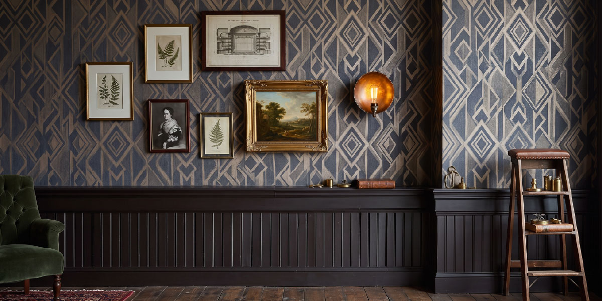
Illuminating Autumn: Layering Colour Trends In Your Home This Autumn
As the evenings draw in, lighting starts to play a bigger role in how a room feels. Colour, texture and light all respond differently at this time of year, so small changes can make a space better suited to darker days.
Layering for the season
Rather than treating autumn trends as a reason to redecorate completely, it can be more useful to build on what is already there. Richer colours, metal finishes, ceramic surfaces and softer pools of light can all be layered into an existing scheme without overwhelming it.
How light affects colour
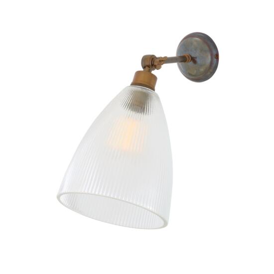
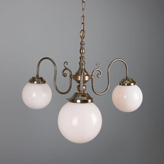
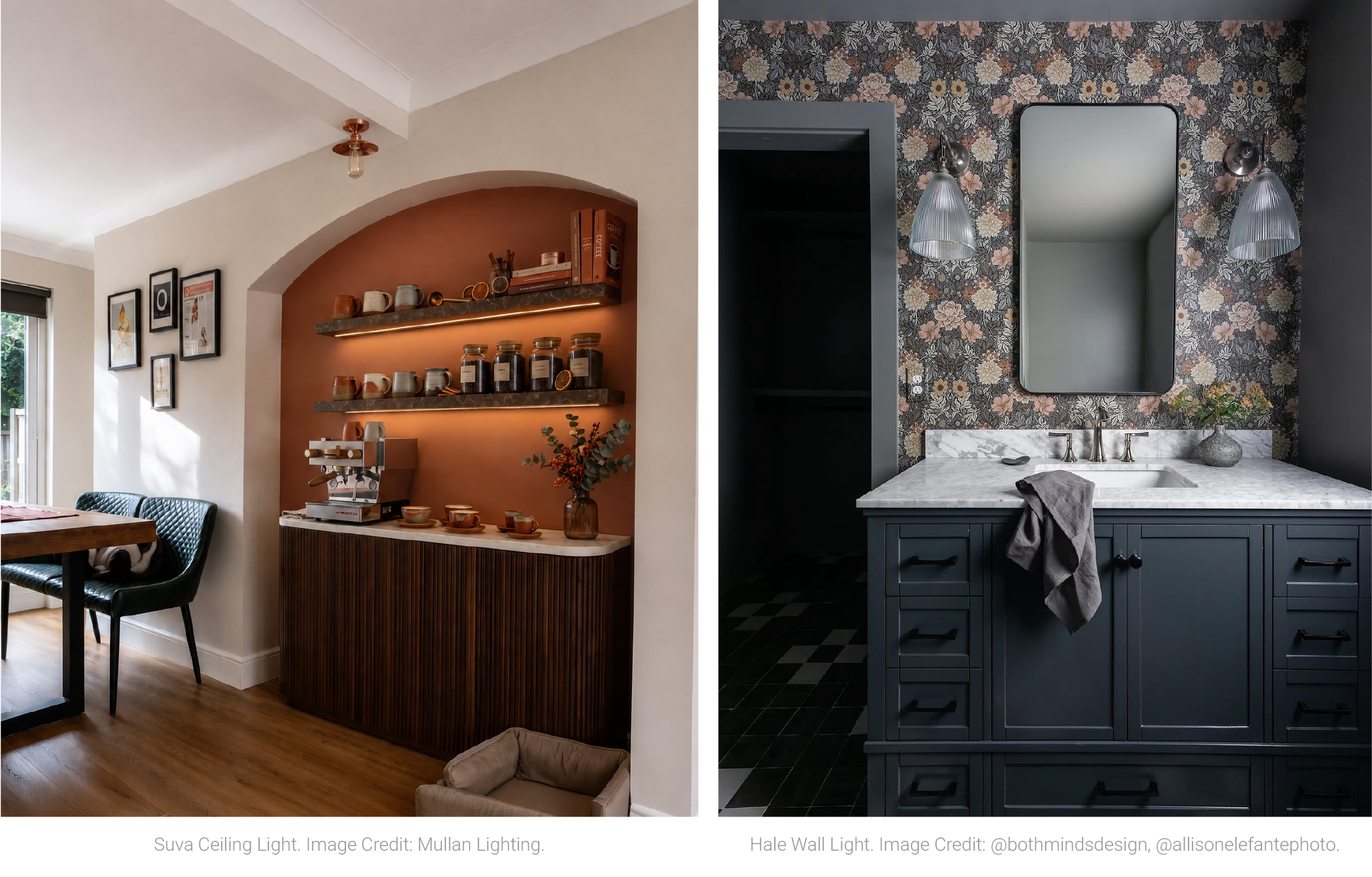
Lighting has a direct effect on colour. Warm light can soften deep reds, greens and ochres, while diffused shades reduce glare and give painted walls, timber and textiles a gentler appearance in the evening. A pendant can provide the main source of light, with wall lights and table lamps added lower down to create separate areas for reading, relaxing or dining.
Autumn colour palette
Autumn brings a broad mix of colour, with stronger tones sitting alongside familiar earthy neutrals. Antique pink, powder-coated red and mustard yellow can be introduced in small amounts through lighting finishes, soft furnishings or accessories. Deeper shades such as sapphire blue, racing green, grey, cream and bronze are easier to layer across a room and tend to work well with timber, wool and other natural materials.
Working with metal finishes
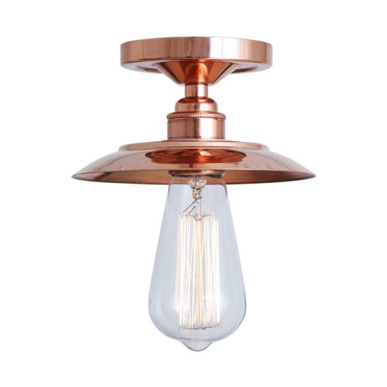
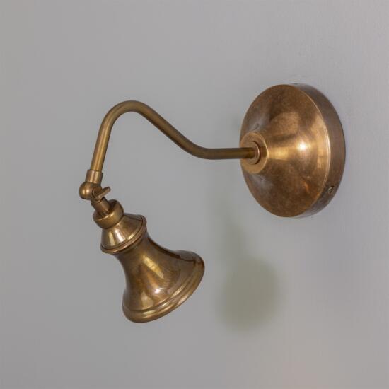
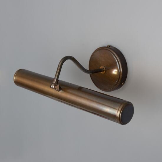
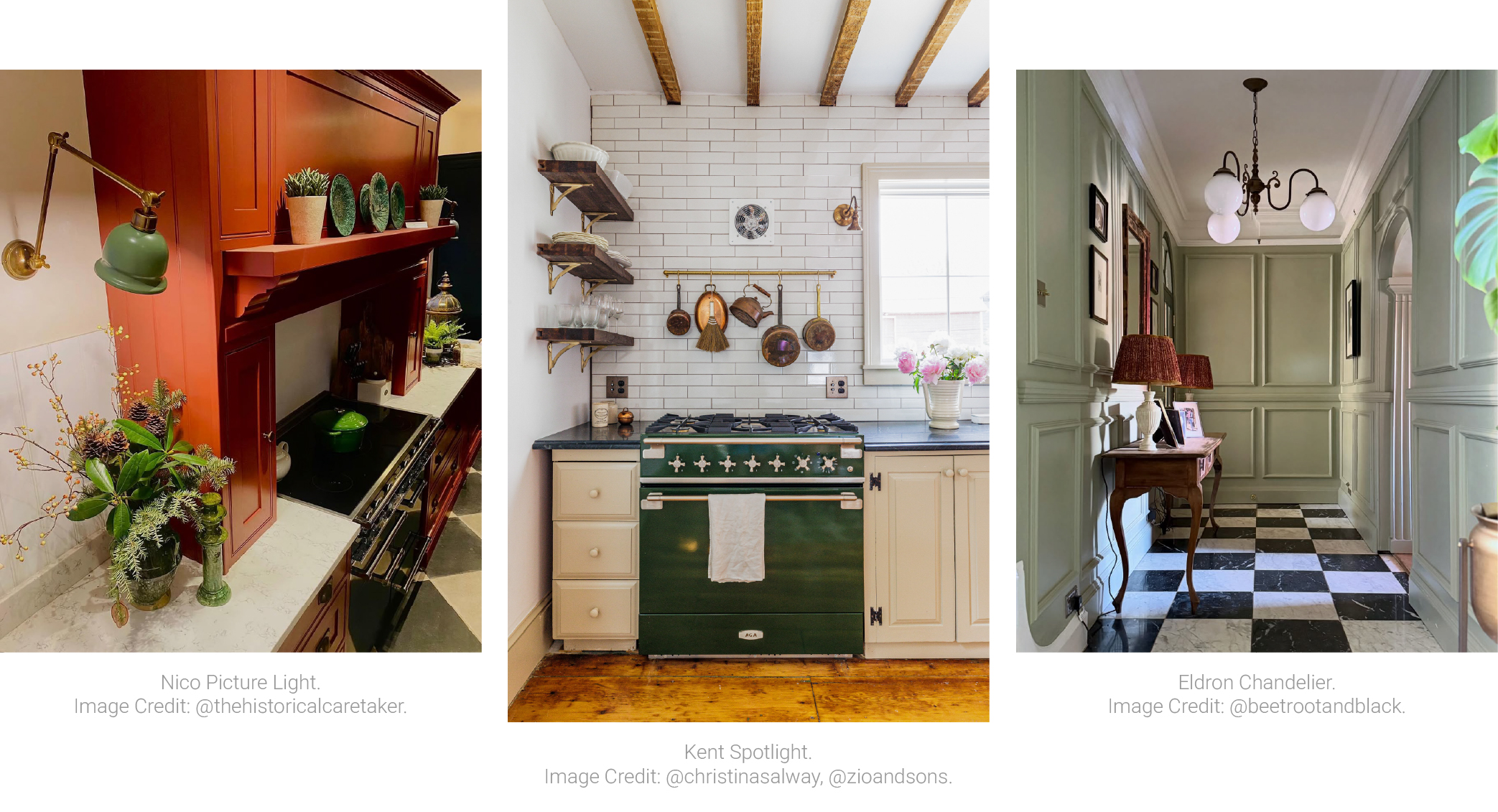
Metal finishes are another simple way to bring seasonal colour into an interior. Antique brass has natural variation in its tone and patina, which works particularly well alongside darker woods, deeper paint colours and textured fabrics. Antique silver gives a cooler, aged finish, while polished copper has a stronger reflective quality and picks up surrounding colours and light.
Adding colour with powder-coated finishes
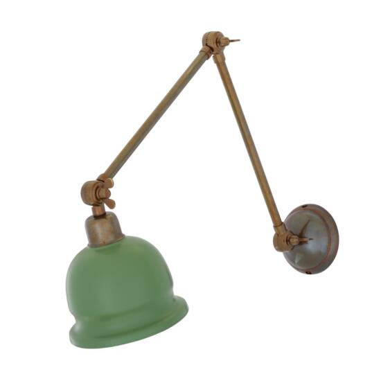
Powder-coated finishes allow colour to be used more directly. Sage green and racing green sit comfortably with autumnal materials, while pink, red and honey yellow can be used as smaller accents where a room needs contrast.
Layering light levels
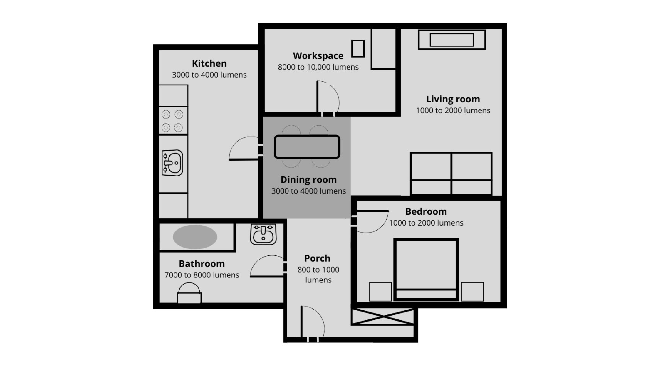
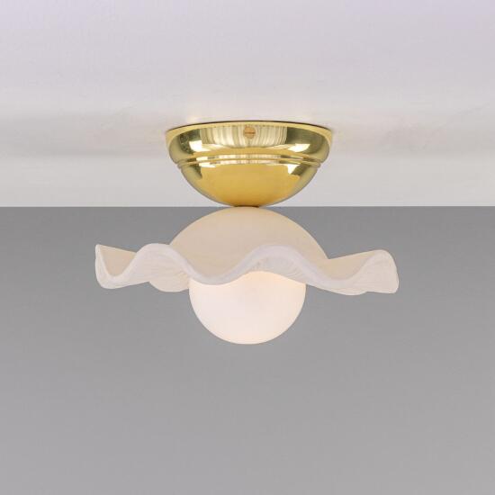
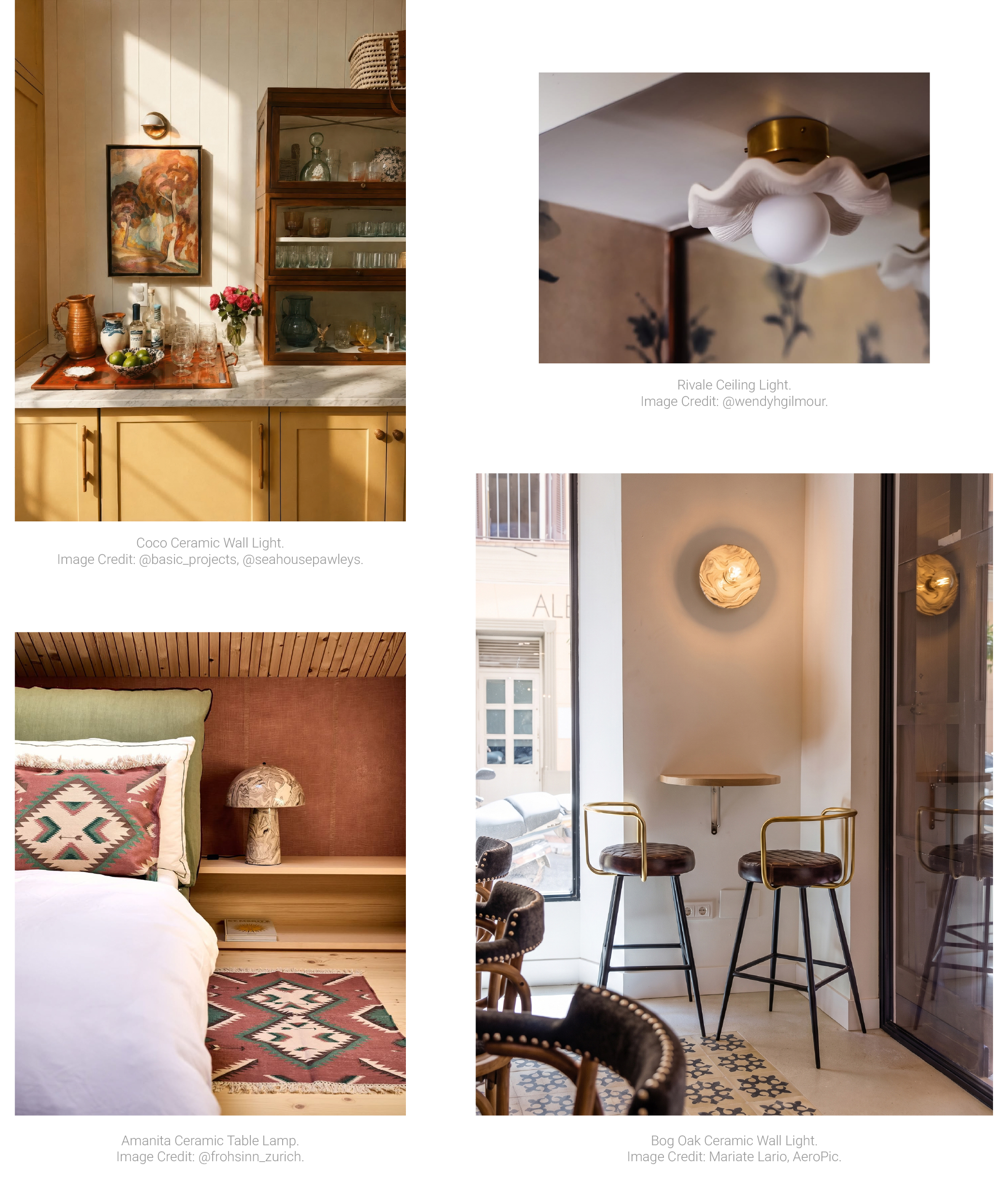
As natural light fades earlier, placement becomes just as important as finish. A single overhead light can leave a room feeling flat at night, so it helps to use several sources at different heights. Wall lights beside a sofa or reading chair, a table lamp in a darker corner, or a dimmable pendant over a dining table can make the transition from daytime to evening feel softer.
Colour temperature and dimming
Colour temperature matters too. Warm white bulbs tend to suit living rooms, bedrooms and dining spaces, particularly when paired with brass, copper, ceramic or deeper paint colours. Dimming is useful where the same room needs brighter light during the day and a lower level later in the evening.
Small seasonal changes
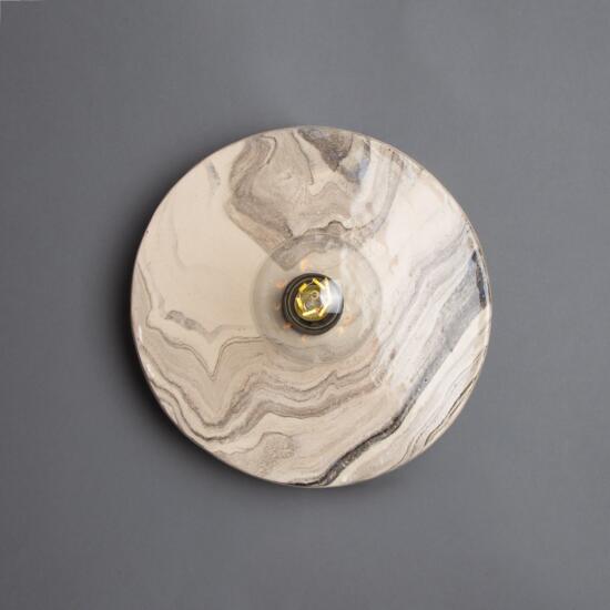
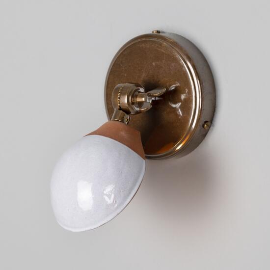
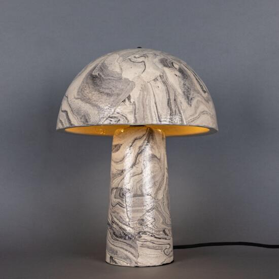
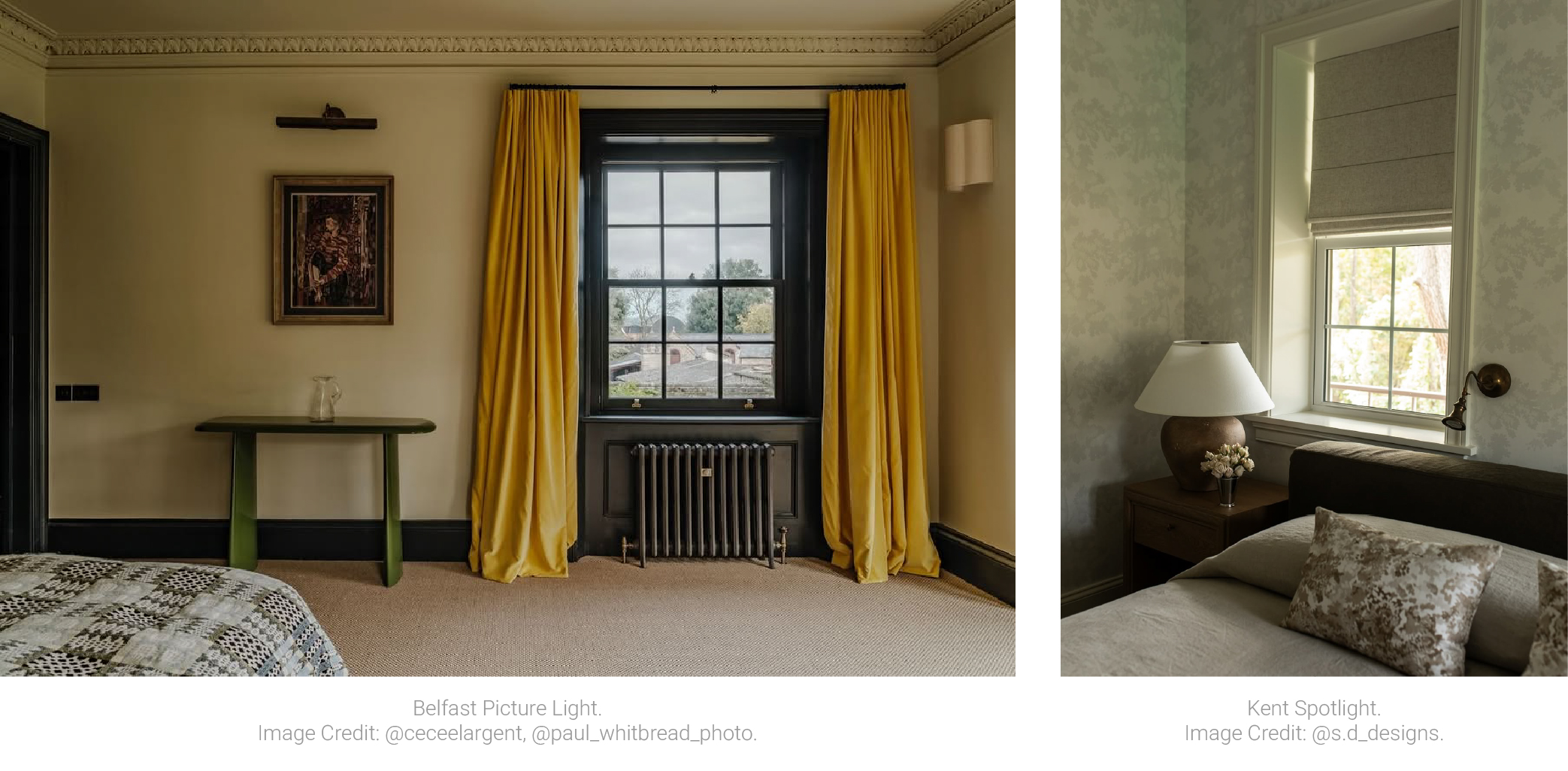
Autumn interiors do not need to rely heavily on seasonal decoration. A few changes in colour, material and light level are often enough. A wool throw, a timber side table, a ceramic surface or a metal finish can all add depth, especially when the lighting is well placed.
A practical place to start
The aim is less about following every seasonal colour trend and more about making a room feel comfortable as the days shorten. Start with the lighting you use most in the evening, then build around it with deeper colour, natural materials and finishes that suit the room. A few well-chosen changes can give an interior a clear seasonal shift without making it feel temporary.